Dark Mode Design: Enhancing User Experience in Mobile Apps
Dark mode has emerged as a key component of mobile app design in recent years. In addition to being aesthetically pleasing, dark mode design provides a host of advantages for users with its refined and classy look. This design pattern has become increasingly common in apps, from social media sites to productivity applications. In this article, we will examine dark mode design and how it might improve the user experience in mobile apps.
Understanding Dark Mode Design
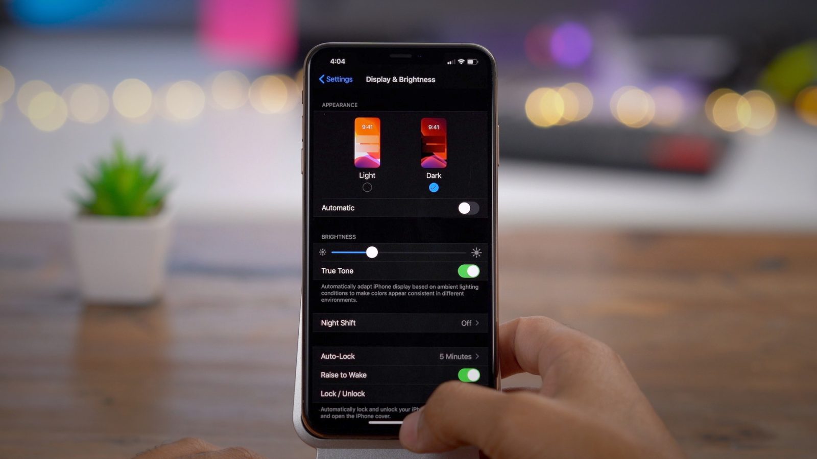
A design option known as “dark mode,” sometimes called “night mode” or “dark theme,” modifies the color palette of an application’s user interface by using lighter text and objects on darker backgrounds. Dark mode substitutes gray, blue, or black backgrounds for the customary white or light-colored ones, resulting in a softer and more muted visual experience. Users can choose their preferred interface style by toggling this mode, which is usually given as an option.
The Appeal of Dark Mode
For several reasons, dark mode design has become incredibly popular, and its allure extends beyond looks. The following are some of the leading causes behind the popularity of dark mode in mobile apps:
Diminished Eye Strain
One of the dark mode’s most important benefits is its capacity to lessen eye strain, particularly in dimly lit areas. Because the darker, softer colors are kinder to the eyes, using the app for extended periods without experiencing eye strain is easier.
Extended Battery Life
Using dark mode on mobile devices with OLED or AMOLED panels prolongs battery life. When displaying dark, these panels can switch off individual pixels, which uses less power than lighting up every pixel for a bright, white interface.
Improved Accessibility
Visually impaired people may find the app easier to use in dark mode. In dark mode, the contrast between the text and background is sometimes more pronounced, facilitating more effortless reading and navigating the interface for those with limited eyesight.
Visual Appeal
There’s no denying that dark mode is chic and contemporary. Users greatly appreciate the grace and refinement it brings to an application’s design since it may make an excellent first impression and enhance the user experience.
Diminished Disturbance
Using a mobile app UI design with a dark background is less disruptive in low-light conditions, such as at night or in a dark room. In these situations, bright, white interfaces can be startling, yet viewing in dark mode design is more comfortable.
Improving the User Interface
Now that we are aware of the benefits of dark mode, let’s examine how it improves the user experience in mobile applications:
Customizability
Users can frequently select between light and dark themes in dark mode designs. Giving customers the option to choose their favorite mode provides them with a sense of customization and control, which can improve the user experience.
Platform Consistency
A lot of consumers alternate between desktop PCs and mobile devices regularly. Because dark mode is now extensively used in many operating systems, online browsers, and apps, it guarantees a uniform experience across platforms.
Pay Close Attention
Color contrast and text legibility must be carefully considered when designing for dark mode. This attention to detail makes an app more straightforward to use and read and makes it seem better.
Diminished Glare
The dark mode design reduces reflections and glare on the screen, which is particularly useful for people who operate outside or in brightly lit areas.
Fit for a Variety of Apps
Dark mode is not exclusive to any one kind of application. It is adaptable and may be used for various genres, including productivity tools, social media, reading apps, and gaming. Dark mode can enhance the user experience in various mobile applications because of its versatility.
Difficulties with Putting Dark Mode in Place
Even though dark mode has many advantages, several issues must be addressed when implementing it in mobile apps. The following are some typical issues and things developers should think about:
Image and Media Adaptation
Ensuring multimedia content, icons, and images appear good and make sense when displayed in dark mode. Use adaptable strategies like dynamic theming or offering substitute assets exclusive to the dark mode. In dark mode, make sure that icons and graphics have enough contrast with the background.
Animation and Transition Effects
Making sure that transitions and animations are smooth and aesthetically pleasing in both light and dark settings is known as animation and transition effects. Adapt animation effects and speeds to each mode’s style. Make sure transitions stay seamless and don’t negatively impact the user experience by adequately testing.
Color Contrast
Ensure enough contrast between the text and background for reading in dark mode. To ensure accessibility and legibility, developers must carefully choose font sizes and colors.
Brand Identity
An app’s visual identity and branding may change when in dark mode. Developers must find a way to balance customization and consistency so that the dark mode complements the app’s overall design.
Testing
Designing for dark mode must be thoroughly tested to find and fix any problems with usability, performance, and visual consistency across many platforms and devices.
User Adoption
Only some users may find a dark mode comfortable or to their preference. Offering a selection of light and dark themes is essential to satisfy various user tastes. Check out the user adoption of Android and Windows, as it represents high acceptance for Dark Mode.
System Integration
When designing for dark mode, developers must consider how it will interact with users’ devices’ system-level dark mode settings. This guarantees a smooth and seamless app integration with the user experience.


